5 Tips on Getting Started Creating a Graphic Novel – Part Two
In our last blog post, we gave 5 tips on getting started creating a graphic novel or comic, focusing on writing. In this post we’ll give 5 tips on page layout, or thumbnails.
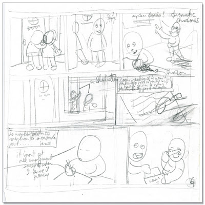
Making several drafts of page layout, or thumbnails, is often necessary in order to tell a story in the best way possible. With layout, the possibilities are endless, and this is where you can really take advantage of the dynamics of sequential art, playing with and balancing out words and pictures, space and composition, and pacing, to full effect.
 |
| A typical thumbnail page or layout page for our Louis graphic novels. |
1. Choose a layout style which suits your type of story. If you story is action packed, a dynamic layout such as that used in manga for example, with lots of angled panels or panels spreading over to the bleed, may be most suitable. Or if your story is more realistic, like a slice of life for instance, you may want to choose a more simple, straightforward layout. For our Louis graphic novels, we use a 9 panel square grid rhythm as a basis. This echoes the square format of the books, and reinforces the picture book feel which we wanted to create. This rhythm also suits Louis’ monotonous life.
 |
| 9 panel grid rhythm: a page extract from Louis – Red Letter Day by Metaphrog (new edition). |
2. Change the pacing to suit the different types of scenes. Pacing refers to the rhythm of the panels and the flow of reading. You can have a basic rhythm (for example, as in the 9 panel grid of the Louis books) and play around with it, depending on what is taking place. On the Louis page below, we slowed the action down by using a big panel at the start, and then speeded it up with small panels.
 |
| Varying the panel size: a page extract from Louis – Red Letter Day by Metaphrog (new edition). |
3. The whole page is a panel. See the page spread as a whole. As each panel needs to be structured and composed, so does a whole page, and so does a page spread. A page and a page spread need to be pleasing to the eye and also tell the story at a glance. For example, a Louis page often contains the most important information, or the key panel, right in the middle of the page. On the page below, Louis’ pet bird FC is very ill: a close up of FC lying unconscious is placed right in the middle of the page.
 |
| Extract from Louis – Night Salad. |
 |
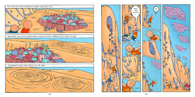
| Double page spread from Louis – Night Salad. |
4. Use empty space. It’s in the gutters (the gaps) between the panels that the imagination of the reader goes wild. You can achieve great effect using blank space. It can put emphasis on an image, for instance. Or it can even help reinforce ideas or what the character is feeling. In the page below, we placed a single small panel on an empty page to emphasise Louis’ loneliness.
 |
| Extract from Louis – Night Salad. |
5. Think of what the page turner is. Unlike novels without pictures, when turning a comic page, you can’t help but immediately see what’s going on on the whole page. So if you have a surprise panel, it can be a good idea to show it after a turn of the page, as we did on the page below.
 |
| On this page extract from Louis – Red Letter Day, see how we established a clear page turner. |

