Anatomy of an Illustration

Recently Sandra created life-size illustrations for an exhibition at Borders Textile Towerhouse about the local high street. The exhibition, Vision 2014, was focused on Hawick’s delicatessen Turbull’s, and its rich history, dating back to 1855. A group of school pupils were given the task of brainstorming and setting up the exhibition, and we helped them during an afternoon of workshops.You can read more about the background of the exhibition and how it came about in our previous post here: http://metaphrog.blogspot.co.uk/2013/04/exhibition-at-borders-textile-towerhouse.html
This is the final artwork, and this blog examines how Sandra created it.
 |
| Sandra’s final artwork |
First, very rough sketches were made during a brainstorming session with the pupils. Back in Glasgow Sandra then started by drawing blue pencils in Manga Studio.
 |
| Blue pencils |
The pencils were then inked, again in Manga Studio. The artwork having to be life-size, it seemed the best way to pencil and ink was directly on screen at high resolution, rather than making the drawings on paper and then scanning them. As the artworks were to be enlarged Sandra worked at 1200 dpi.
 |
| Inked drawing |
The inked drawing was then exported to Photoshop where the black ink was changed to a burgundy colour and a light pink. For the colouring, Sandra worked in layers using various artistic brushes to emulate paint and watercolour. She also used a number of textures for different parts of the drawing, which she manipulated in a collage-like way, changing the positioning, brightness, hue and saturation for example, until she achieved the desired effect.
Here are some more detailed views. The speech bubble in Detail 1 is made of old paper texture, and the garments are made up of manipulated fabric textures.
 |
| Detail 1 |
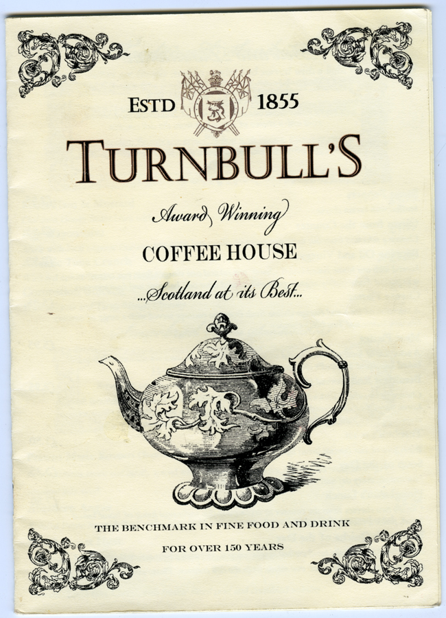
In Detail 2, a genuine whisky label from Turnbull’s (below) was incorporated: scanned in at high resolution and wrapped around the bottle. The barrel is made of a collage of wood textures and the Turnbull’s label was taken from the menu below.
 |
| Detail 2 |
 |
| Turnbull’s Whisky label |
 |
| Turnbull’s menu |
In Detail 3, the pot and tea cup were made up of a number of images (Pupils’ drawings 1, 2 and 3) superimposed in layers and manipulated (hue, saturation, brightness). The elaborate teapot of the Turnbull’s menu (above) was also used as a very faint back layer for added depth.
 |
| Detail 3 |
These three drawings were also made by the pupils during the workshop session with us. The drawings were scanned at high resolution, and Sandra then cleaned them up in photoshop, boosting contrast and changing hues. She then took parts of each drawing and layered them to create a new composite teacup and teapot.
 |
| Pupils’ drawing 1 |
 |
| Pupils’ drawing 2 |
 |
| Pupils’ drawing 3 |
The text parts of the images (on the barrel, board, and speech bubble), were created in Photoshop and manipulated with the Warp Text tool. The figures seen here in situ were printed on thick white board.

